3D Concept and Ideas
At first I began finding what possible films I could base my work on. I chose 12 different movies and games that I already have some knowledge of.
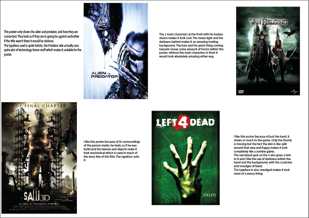


After finding actual film posters, I was told to get some images of Saul Bass inspired images. I chose these posters because I like how they lack so much detail but look so good with what they have done. I have a lot of the just head ones because they really grabbed my attention and really show what it is.


After finding Saul Bass inspired posters, I had to make mood boards following 3 different guides.
First being Characters, Items and weaponry etc.

The second one being locations and areas, this was mostly set in boston. I got both pictures from the game and from reality.

Thirdly was textures, I got textures from locations, character clothing, weather styles and the infected. The infected was a good one because their skin is very distorted and sickly looking.

After finding a lot of information on textures and characters, I had to start finding possible typefaces to go into my final poster. I had to get around 15-20 different types. I had found 18 I find most suitable for my poster.

After finding the 15-20 different typefaces, I had chosen my favourite three and had to edit them to make them my own. I thought they turned out very well but some weren't suitable to be in my poster at the end.

I wanted to chose the one I thought I was most confident with to use in my poster and decided to do 5 more edits to make it fit into my poster. I wanted to do these because wanted to change the arrangement of my words.

Finally I chose my best typeface which I really would like to use and what wouldn't be most effective in my poster.

After I made a few images of what I could put into my poster, I liked them all but some of them had way to much detail to even be considered saul bass.


These are my 2 final ideas, in all honesty I thought they were pretty well done, I did try to make them as saul bass-ie as possible but I didn't work out after looking back at it.

Layer by Layer of My Final Design
This is the background of the entire poster, it works well with the theme I am doing of zombieness

After the background I found suitable typography for my poster, it is mimicked behind with the same wording and style but in a different colour. You can just about see.


After the titles of the game I created the firefly symbol, like the text I have mimicked it with redness from behind maximising its effectiveness.

I wanted to add the logo of the game makers to make it more like a real life poster. Being red, white and black it suits well with my poster colours and designs.


My 2nd poster contained the same symbol and typeface but I added a weapon within the game to make it show that it is a shooter zombie game. The back ground is dark and bloody looking also giving that Zombie effect.

This is a mood board of the objects, items and characters that occur during the series of walking dead.

This moodboard shows the locations that happen within the series, I like these locations because they are very memorable.

These are the textures that are in the walking dead, I got the zombies crumpled faces and the textures of the buildings and other stuff in the series.

 After finding inspiring images I created a few designs that could go onto my development section of the process in creating my poster. The ideas were basic and were enjoyable to create. I have seen the series which makes it easier to understand what could go into the main poster.
I created 2 possible ideas that would look pretty good in my main poster in the end. I like them because they're both completely different the one on the left is a prison which is a big part of the series. The infected sign goes amazing with the idea because the series is basically based around survivors and zombies, in a ZOMBIE apocalypse.

I am not a big fan of this poster myself because it lacks so much simplicity which is a major aspect in a Saul bass themed poster. I didn't really like it so when it was on show I didn't really show it, instead I showed my other two which were more effective but I was able to create a 4th and have more research to make an effective final design within both posters because of the possible textures I could take from one and add to another because of both being a zombie themed storyline.

No comments:
Post a Comment