Expressive Typography
I had began creating patterns using only 1 letter but in a certain font. It is actually an effective way and I have to be honest mine look very well done and quite professional. I had repeated the letter but changed its positioning to make a pattern.

To start this unit off I had to begin by having a person next to me gave me a few words that could be used as an expression typography. I chose 5 of the words that I would prefer to do for my expressive text, I chose to pick Bomb, Noisy, Distant, Bounce and Pool.

I found many images that were expressive typography inspired. I found 15-20 I liked and could possibly get inspired by. Some even contain the words I have chosen which helps a lot on development on new styles of expressive type.

My Own Expressive Typography
Bomb

 I had chosen the word bomb to create a expressive type for, I figured out that a bom was circular and expands with an explosion. I first created a bomb with the O on the outside and the b as a bic. The thing that you light for the bomb to explode, I didn't really like this idea because it didn't look to my standards and wasn't very professional and moved on to having the O explode expanding into multiple O's and the rest of the word scattered from the blast of the O.
FONT: Helvetica.
Noisy
Another word was noisy, knowing what noisy is I was able to come up with ideas of the letters expanding as if they get louder because that is the meaning of the word noisy. It was fairly basic and was good enough for the expression of this word but it wasn't very my standard good, was to simple for me.
FONT: Helvetica

Distant
The next word in my list is distant, I had many options to use from my sketches but wanted to go with this one like the word is coming from the distance. T being smaller in the back and D bigger in the front. I created the same word twice changing the colours to see which works more effective colour wise to show that it is further back than the word in front.
FONT: Bodoni

Pool

 Pool was my fourth word that I chose to do in an expressive style. There were really two options I could go for using the word pool. One being the swimming pool and the other being a pool as in snooker. I based the idea on the pool as in snooker because my first thought was a pool ball hitting into another, going into the P being the pot.
I didn't like the idea of the P being the pot in the way I had done before so I wanted the P to be like the edge of the pool table and under the top of the P is where the ball falls through getting the effect of the pool game.
FONT: Helvetica.
Bounce
My final word is bounce, there were so many ideas I had for it but some contained lines which were not allowed to be within the image. I had reworked it to fit the actual meaning of expressive typography, I added anything else but the word it would give to much away.


These two words are almost the same but I wanted to add more of the bounce to it. At first I wanted to create a simple O in the air but to me it didn't look as if its bouncing more or less flying in the air. I added more O's to the O but using a different shade as if it is moving from position to another one from that point.

 My 2nd idea was the O bouncing on the letters. The one on the left was before the one on the right. I changed it to have a higher bounce and distants the O slightly more. I think it works well because it looks more of a bounce as it goes higher. I do like the effect of the lightness of the black to the darkness of the black.
FONT: Baskerville
Quote Typography Development
I had to begin creating 25 thumbnails of 5 different quotes, each being different so I should have 5 of each for each of the quotes. The more I created different thumbnails for each word the harder it began to create different ones but in the end it turned out pretty well.


Development on the Quotes using Illustrator
After completing all the 25 thumbnails, I had to develop them into illustrator, I wanted to add colour and different font styles to make it much more effective.
My first quote I developed was 'The Light Always Breaks Through' I like this idea because the not so important words are quite darkened but the main two letters 'Light' and 'Break' I thought it would be a good idea to only show partially the word with the yellow breaking through the darkness just like the quote has said.

The second idea of this quote I wanted the word growing larger as it further gets through but the colour also changes to getting from lighter to darkness it depletes the quote but also raises it with the words growing larger.

I like this idea because I like how the light goes off to the distance. The shade definitely helps with this quote but the problem is, is that it goes the wrong way. The darker part should be at the back being he smaller one and the front one should be light. Another issue would be the back ground colour in which being a too light colour unable to see the writing. But the light should also be coming through not matching the back ground so it should be a dark colour.

I like this idea because of the text it has. The typography is a fancy style and I just like the look of it. The issue it has is that the text is hard to see with the colours I have chosen for the poster. A good part by having certain letters not really showing is that it bolds the main parts such as Reason.


I like this ideal because of the word around. The A and the D go around the word and totally makes sense to how the word is actually used. Its also fairly basic and has quite some decent white space which works out very effective to this idea.


I prefer this idea to the other one that is joint with other words because this one actually works and I believe it fits very well. Its so basic and simple which is what we need within this work. It has plenty of white space and works very well.

I really like this idea because it represents a grave if you see. The T stands for the gravestone where as the rest is the grave itself. It means you only have one life and basically live it to the fullest. I like how it was able to be made because it fits perfectly with the 1 Life Live It the I is also with the bottom of the L that is on its side. The background I am not 100% on but I can always develop into making it more suitable.

I like this poster because its simplicity, Its 2 colours, simple type and is just there but it doesn't really show the power. Except that the Power is bigger than the rest but its so minuscule that you can hardly see the difference.

Development of my final idea
During the making of my final ideas, I wanted to make sure I had the correct font that would be effective for a great final quote poster. During the making of my quote, I had to choose the most effective typo that would suit with the quote. I found many from Dafont and thought many were more suitable than others such as the first one is almost thread like and has holes within it and I thought it would be an amazing typo to use because the back ground goes through as the quote is basically saying.
During the finding of the typography I didn't particularly like the plain black back ground and so I added a texture, which was a texture I had used from the internet and I decreased its Opacity and to be honest it works very well its makes it more lookable meaning you want to look.


Final Idea

In the end of creating both quotes, I chose to do these two. 'The Light Always Shines Through' and '1 Life Live it'
I really like the type within the left side quote because its not over the top it fits perfectly within the poster and isn't a misfit, I also kept the background I used in all my development obviously because I really liked how it turned out. As you can see the words are different shades coming from dark to light which also pushes the quote more into your face which is what I originally wanted to do. I had figured out the idea early in the process but it was the wrong way, so it would more or less look as if the light is going away when it should be coming through.
On the right side I used the same background but different colour. It gave it an old war type feel to the poster style, I believe it worked out well with what the quote has to say since war is a grimey place and I originally based it on that, war. I put it how it is because as you can see it looks like a grave with the T being the tombstone. I thought it was a pretty good idea but many didn't understand how it should have been read. An issue is that the ife and ive part of Life and Live are hardly recognizable due to the background. That would be a future improvement if I were to do again.
Redesigning a Recipe


Moodboards

Here is some cutlery that is used within creating a pizza, I thought it would be handy to create such a moodboard because I can get a better insight as to what I could include within my final recipe.


Here are 2 posters of italian pizza's, this is where pizza originated from and I could use the images for inspiration in my final recipe.
I could easily create a pizza with the toppings it has or I could even make it into a pizza cone styled one, the options are endless in what I could create.

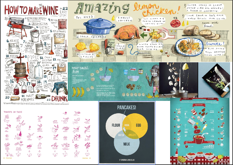
Here are a few visual recipes already created, looking these up, I am able to get a better insight as to how I could create my final idea, I needed inspiration and these gave me exactly that.


Here are movement ideas I could use my work in its style, I really liked the puzzle face that is falling apart and I did make an attempt to make it that style because all ingredients add up to the finished thing and making it a very effective recipe.


Here is my final idea, it didn't turn out 100% as how I planned as it was pretty difficult to make it the way I want as well as make it easy to see. I made it the best I could and the best I could turned out like this in which I still like very much!
Visual Posters

This poster is visually catching because it is one of my interests and would definitely see it from a mile away! It easily shows what it is. It is an art festival, but it could be quite misleading with the single picture. It is anime styled but it is deviantart which is a site for many different art styles. It gives the info needed 'At Anime Expo' and the dates of how long the festival lasts, 3rd to the 6th. The poster is effective because it relies on art and the poster is about art.

This poster is visually appealing because of its use of colours, even though it doesn't give off major hints on what the festival is in fact about it grabs your attention. Hence the reason why its in my blog, it caught my eye and so I had to include it. I like the use of pop art style to it, using bold colours. It has some information on the bottom to indicate what the poster is about, which would be advisable.
I think this poster is effective because mainly of the colour and patterns it has, it makes you want to see what it is that they're trying to promote with their advertisement of the poster.

As the one before this poster is visually appealing with its colour and the images it has within the poster to grab your attention. Rather than the other using such small text and only using the pattern and visual demonstrations to grab your attention this also has text among it which also grabs your attention. Some words are bigger than the others 'Film' and 'Festival' because if you were to look you would want to know what it is first of all you are attracted to.
Overall this is an effective poster with its bright colours and use of typography

Now this poster, I was really intrigued about because of the image that is in the middle. It was so different and cool looking I had to look twice. I don't even know what the image has to do with the festival of glastonbury but I found it attractive by its first view. I like the use of colours it has. It consists of only a few colours but thats why it works so well. It didn't need a bunch of bright colours like other posters. It has information on what sort of poster you are looking at which helps a lot due to lack of the image giving any details.
I believe its a good poster but flawed with having nothing to do with the poster. Well, from what I can see. I am sure Glastonbury Poster is generally suited to a music theme but yes the image maybe different but it absolutely grabs my attention which also makes it a good poster.

This poster is visually attractive because of the image it has. The image you can easily tell is a face with a instrument of some sort. The instrument can easily symbiosis that is could possibly a musical festival poster. It also has the details at the bottom of the page that is crucial for the viewer. The colours are the most attractive thing to get the audiences attention. They are bold bright colours and of course make an image using them which is an effective poster.

This poster is very effective because it uses a realistic illustration of possibly a fans piece of artwork. I goes entirely well with the point of the poster which being an art festival. There isn't much to say about the colour because its not exactly about the colour in this poster it is what has been created. The colour it realistic and has a great use of colour and tone. Overall the poster is effective because mainly it shows exactly what it is and has the information needed.
Typography Posters

The typography within this poster and i believe the colours and the text style match perfectly but the slight problem is that people generally have a quick glance at posters you either grab their attention or you don't. But when you do they don't want to be there too long having to read to much. Other than that I believe this poster would work perfectly for people who are interested in such posters. Another point towards the colour is that pink can be found quite feminine so if its a unisex festival (Most like is) Men wouldn't find this 100% appealing, depending on their colour interests. I like the the art in the middle of the text, I found was pretty well done and having the music notes clearly shows that it is a music festival.

I like this poster because of the image it has taken on. The fact that it is scream from a horror movie I could totally see that in how the text has made it out to be. It also has a lot of white space which makes it effective for such a horror styled poster. I like the text in this because it is altered and shaped into the scream, it has a well fitting font for the style of the festival which being a horror film festival. But there is a slight problem is that it can be found hard to read which is angle alterations but other than that it works excellently.

This poster is a perfect example for how most posters should be, It has colour and text which is all it needs. The colour to grab the viewers attention and the text to show the details of where and when the festival will be held. I like the colours because they blend in well together to make a great looking poster. I also like the font of the poster it works well because the more important parts being 'Music Festival' Is bold out to show its the more important part of the poster, people have a quick second to look at the poster and which a title like that they'll know in a click that its a music festival.

This is another poster that rely's on mainly colour to grab a viewers attentions it used Red, Black and White. Black and White are good colours to choose since they go with any colour. Red is another colour that is warm and quite easily seen. This poster used great font for its information and gives ever detail needed and of course has the main parts in a bigger font to give the main details out thats needed for the ones that have a quick second to see it.

I like this poster because of its basic colours. It grabs the attention even without the bright colours usually needed within a poster. I also like this typography of the text as its not entirely symmetric. I also like the image within the picture its about the voice and shows the mouth which is how people actually speak.

This poster has a lot of white space which is very effective in a poster. The designs around the text also look like a guitar with text filled in. The typography is quite childlike but I like that to be honest, its irregular and isn't all the same size.
Game Festival Posters

This game poster is effective with its colours and its white space around the text. The background contains some sort of karate guy, I would assume that it is to do with a fighting game.
The poster gives the information and uses a limited amount of colours. It also has its sponsors to also promote them which is quite effective to show who is to do with the poster. If microsoft or Sony were there it could definitely will grab peoples attention depending on their interests.

This poster lacks a lot of blank space but definitely promotes what the festival is about. You can clearly see that it is a gaming festival with the games and the sponsors at the bottom. The big names such as PSNetwork or Xbox Live is there. Its definitely a big poster. But its crushed up title in the corner makes it hard for people who do not know what the characters are used within this poster. So it can be an issue for many people.

This isn't necessarily a gaming festival poster but its an effective poster with its colour limit, even it being bright and limited it grabs the attention. It also has the picture of a controller to show what the poster is about so that also makes it effective.

This is a gaming poster that has a lot of gaming aspects within it. It even has the retro game of Pac-Man in the back ground. The colours of the typography fits well with the controller as they're the same colour. The typography suits well with the sort of game style its quite blocked.

This poster is effective because it uses pictures from its previous festivals. It even gives bits of information on what happens there which is neat. I like the colours and text used its like many of the other posters which is quite a general gaming quality.
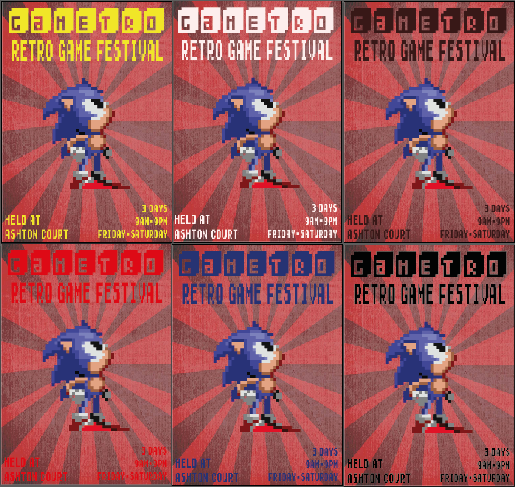
 I like this poster because of its retro aspects, the fact that its pixels which basically is retro style is fascinating. The type of the title fits perfectly with what its trying to say and the colour of it blasts right out into your face which is infact the point of the poster to grab your attention even if its for a split second. In that one second you would know its a retro computer games festival. In the poster there is a image of an old retro game pac-man. I like it because its retro and is 100% to do with the festival! I would possibly use this as a major inspiration for my work.


 I like this poster because of its simplicity. It doesn't have 10,000 colours or a jumbled amount of images. It has the suspension bridge with a rainbow trailing over it to represent Gay Pride I believe. Since it used a rainbow colour which also means gay pride (Or so I have been told) Its to do with such a thing. The title is Bristol Pride but the Pride is infact highlighted in a pink which is quite feminine and if a guy were to like it in some ways people may find it gay. Although I find it just a colour, it doesn't really mean much of it. But this is an effective poster because of its white space and its basic details.
Typography

I like all these types because they are all good in their own way. but the top 3 I would use in my style of poster would have to be
RACEI Brannt Chiseled NCY
WRESTLEMANIA
and Broadway
I like Racei Brannt Chiseled NCY because its quite a retro styled text and would suit my poster fairly well, depending on its image design. I would even add colour within them white spaces using bright retro styled colours to make it more of a retro theme.
WRESTLEMANIA is another text style I like because of the things I could do to the blank spaces within the white spaces. I want to be able to make it into my own style rather than copying the text fully. The fact that it has white space makes it possible for me to be able to make it retro.
Finally Broad way because I can fill them black or white spaces again. I like all these texts mainly for that reason. I am not tired to having one single colour within the type I have and it will make my poster far more interesting being seen as a person walks by.
Antique Book Cover is a nice font in its own way, but an issue would be that it doesn't entirely represent a retro style. It wouldn't work within my poster style, which being a retro poster. The Bauhaus typo is an interesting one which can be quite considered a retro style font, but I dont think I would use it in my poster because its not really sharp, its curved and I do prefer it to have a sharp edge because retro is quite a pixelated style of gaming and so it would suit its needs.
Elephant is a great typo and contains sharp and curved edges and it could easily suit its needs within the retro style. Even though its a bold style its still suits its needs of retro since retro is quite bold within its titles from what I have researched. Gladifilthefte is an interesting font that would be possible with a retro poster but I wasn't 100% sure it would be good for my poster, even though I have seen it within a mario game, I wouldn't feel proud that I try to go out of my way to make sure people know exactly what it is without having to guess.
Hand Drawn Type

I like the first typo I have created because I always thought a gaming poster would be so sharp and look like that. I had used Game instead of my name because I didn't have a name.
I like the second one because I had mixed an image in with some of the letters to make a controller, I think it turned out okay but it would be to much for a retro styled gaming poster.

Drawn Development
Moodboards


Hand Drawn Designs

Here is one of my ideas this one is based around for a tetris style, I didn't go into much detail because I didn't know 100% to write on there but I like the position of it all. The T is also a neat idea because it could represent Tetris. Its also a good idea to be able to split of the information,

Here is my 8 bit idea, I did it basic because I was thinking of mario but during the research I was able to find many other retro styled characters and choosing Mario would be too easy.

Another tetris idea with a different layout.
Development of First Idea
I needed to create the game board for the game first of all and I thought that a plain lined version was lacking something. Its glow. I had to copy the version I had created and then blur it out to make the effect. As you can see below this screen shot that it works well and looks far better than just a plain version I had before.


During the creation of the tetris I had created a version that was quite plane and simple colours. I didn't think it looked very well done and neither did my peers so I went back at it again and added shades and lighting to the tetris blocks and I found them looking much better and I liked more work 100% more than before. I even began to style a few words using the blocks to see how they turned out. I think they turned out pretty OK but didn't satisfy me 100% and so I didn't use it in the end.

Placement Of Final Idea
During the placement of my idea, I wanted to try and make it in the tetris style because of its retroness, but I also had to put the information in a good composition and so I did a few tests on how I could make it work. I tried putting it in the middle but it didn't really look its best neither did it look like a tetris board and so I moved it to its original position within the game its self. I was told my teacher that I should move some text around and take some out. Considering that having a bit of white space is okay within a poster and is quite effective I understood his point and in the final placement it looked its best.


Development Part 1
I wanted to play around with the colour to see which looks most suitable and to be honest they all work well. They all stand out and suit the poster its self, but considering that tetris has a blue back ground I thought it would be best for such a poster.


Development Part 2


Poster Idea No. 2
I started off by creating the pixels that I would have possibly included within my next poster, using retro games from Mario, Zelda, Pokemon, Pac Man, Sonic and Space invaders. The way I had created this pixel arts I had used the grid tool. Using the arrow keys I am able to adjust the size of the blocks that are required. As you can see the 2 mario's have completely different block size. To be able to make the colour fit within them boxes I had used the hotkey 'K' Which being the live paint bucket. This worked most effective rather than having paint.
Placement of Idea
Here are the stages of the placement of my final idea. Through out the stages I wanted to see what would be best for a effective poster.


Development Part 1
Before finally creating my poster I had some editing to do on my poster. The fact that the pikachu overlaps a major part in my poster isn't the most attractive looking thing when only moved to the back. So I had to clear the bottom part so that the box below him isn't covered to ruined by pikachu's body.
I wanted Mario to fit within the page but I didn't want him entirely on the page because I thought it would look so much better if he was partially off the page. I had to cut part of him as well because it would be included within the print out and I thought being able to show my development was effective to show how I came to my final Idea.


Development Part 2
Here is my development of changing the colour of the type because I wanted to see which would be most suitable for my final idea. I really like the white and yellow most as they really do stick out compared to the red and blue. That is the point of the poster is to be able to attract the persons attention and so I thought yellow and white were fairly bright and were the ones to attract my own attention.

After getting feedback from a few peers, I asked for their opinions. They had said that the background doesn't 100% fit within the style of the retro poster as well as the Mario. Due to its mass of detail within the pixel style.

And so I decided to add the old school Mario, which is basically the retro version and would more likely fit in within this poster. But I really like the Mario I had created before. It rocked in all honesty.
3rd Possible Idea
Here is another possible ideal I had come up with only using simplicity of the single character, I wanted to try out this to see how it can be done since the poster before is quite over filling with its old retro characters. I wanted to try all colours and thought some were effect where as others were not. Such as the red, its pretty hard to see because of the back ground.

I have adjusted these to make it look much better than before moving around the information to make it to its best ability. I included the location with the type of festival it is which allows me to be able to have a lot more white space and its easier for the viewer to read instead of having to look around the poster to see the important aspects of the festival. I adjusted the time and dates of the poster so its easier to read in the middle it also shows off more.
Final Poster

Design Report
Benjamin Johnson
Unit 4
Bjinteractivedesign.blogspot.com
My inspiration of finding out the different expressive types by
creating different styles of patterns using different moving the letters into
position. I did this because I am able to create effective expressive words
more effectively and already have experience in being able to alter type to
make a decent pattern. I had first found a bunch of expressive types and
created a mood board so I am able to get a lot of inspiration within my final
expressive types. This worked out effective because having inspiration I am
able to create a fairly effective expressive type.
I believe my work for expressive is quite effective because of how I
have produced it, the type and textures work out very well for the type of
quote I have chosen which being ‘1 Life Live it’ and ‘The Light Always Shines
Through’. I believe they are fairly done to a professional standard because of
how much time I had spent with the effectiveness of the research I have done.
If I could start again I would definitely change my quotes to see how effective
other quotes could possibly be use. The experience was OK it wasn’t 100% my
favourite part of the unit but I still had a nice time being able to create
something new for the first time and gaining the experience for real life
possibilities in the future.
After that was visual recipe, visual recipe we started by finding a
recipe I could use to create my very own visual recipe. Finding images and the
actual recipe worked out effectively on me know what I must include within my final
recipe. After finding the ingredients and equipment I had begun to find other
visual recipes to use for inspiration having these I am able to create my very
own visual recipe effectively because I already know what to do. I feel my work
is a decent standard and if I had more time I could make a far better visual
recipe but since I didn’t have enough time management I didn’t use it
effectively. I based my final idea on a puzzle style I had seen while
researching art styles, as you can see research has definitely worked to my
advantage since it made my final recipe pretty decent for what it is.
To find inspiration I had begun to find posters of all kinds at first,
some visually effective and others that were typography. Doing this would definitely
help me within my creation of poster style. I was able to judge and put my
opinion into each side of the poster styles and even though some are purely
text based it still makes an effective poster and definitely gave me a hard
decision on what I would want to do. I was researching all these because I
wanted to be able to get a simple idea as to what sort of festival poster I
could create and get a decent grade for. By doing this research, I had noticed
that many had quite a lot of simplicity and that’s what I was aiming for. At first
I had thought that posters needed a lot to be a great looking poster but it
turns out simplicity is the way.
Researching is important because of what I had just said before,
having just theories to how effective posters look isn’t generally the way to
go since you are not able to gain the inspiration needed to know how a
poster generally looks. If I had not done the research, I would have never
gained the sight on how a poster should and would definitely be effective in. What
makes a good poster is having inspiration from other posters, having good
research in different styles of posters is how you gain the quality within your
poster. Whether it’s purely text based or visual based, too much can kill the
poster so having some simplicity within it makes it far more easier to read and
for the viewer to understand, since they will be able to find the information
instantly without having to search.
Having too much information also can be a killer on a poster, you want it short
and snappy so the viewer doesn’t have to spend a while looking for information,
they are only generally only to pass by having around 1-5 seconds for them to
gather as much information as they need.
Throughout my poster development I had made sure I had found posters
that were related to my subject poster, since it was a retro festival that was
what I was aiming to find. After finding out the information I had researched
into different retro games and had created a few mood boards of what sort of
character and game possibilities to have within my poster. I had created these
mood boards because I needed to know what sort of game characters and game
styles I could possibly add in my poster to make it 100% relevant to the
festival, if I were to stray off and do a different era of gaming styles it
wouldn’t be effective and relevant to how my poster actually is and it would
definitely make my research irrelevant. I had created a few paper ideals to how
my poster would look, plotting and placing images and text in certain places.
Doing this I am able to gain a visual sight to how my final poster could
possibly look, it helped very much so and worked out effectively as I was able
to create my final posters with ease instead of having to plot everything
through trial and error.
Moving onto the text side of the poster, I had found multiple text
styles that could possibly work within my poster but sadly none of them were
what I used until I had found one type which definitely suits the retro needs.
I had found the type within the long search of retro fonts, I am so very glad I
had found the type because it has made my poster look a whole lot better. I
also used another type that is also retro themed and it was for the
information, I couldn’t stick with the simple text so I had to find a decent
looking type face.
During the research I had begun to create my own sprites for the
poster image as I really wanted to have some retro game characters in there. I
had created around 5-7 different character sprites which were all effective in
their own way. It took me around 3 hours to create one of the sprites I had
done but I believe it was definitely worth it with the outcome I had with the
sprite. The funny thing about it, is that I never used the sprite in the end because
it wasn’t filling the retro needs as it was more or less updated to this time
of age.
I believe my work is very effective because of the colours, type and
images I had used. The fact that both of my posters contain some amount of
white space makes it that much more effective with how posters should be. It should
be simple and easy to read and I believe that is what I have produced to create
an effective poster. I also believe the colours I had used are effective be
because they were quite retro coloured since they didn’t have too much shades
they were just one standard colour and retro was pretty much about that, basic
bright colours and so I attempted to stick with that theme. My work is definitely
to a professional standard considering the amount of work I had produced and my
development to create such posters took some time. It includes white space, in
each of the posters and has suitable needs towards the retro style.
The entire research side of this definitely matches the posters I have
developed as I have used parts of each sort of poster such as the type suitable
for posters that aren’t even relevant to my poster, the text suited their needs
and I needed to do the same. The fact that I have created mood boards of
different retro posters and retro games also helped improve my final outcome,
so yes all my research adds up to make my final piece. If I had more time I
would create a few more posters and have my peers see which is best because I
had so many more ideas while creating my final posters but I wouldn’t have had
the time I creating the research and the actual final outcome for the posters.
I would have probably made more drawn designs as well so I could have a
reliable source to use as a reference in making an extra poster or so. I found
the experience in creating these final posters very enjoyable, I was able to
pick which subject I could base my poster about. I was free to be able to do
what I want to do, instead of being tied to one thing, the fact that I am able
to do my own thing definitely makes it a more enjoyable experience since
obviously I would have more knowledge of what I really enjoy and would work
harder in creating something I love and enjoy. Given the freedom I was able to
express my likes within a final poster which makes it very effective since you
wouldn’t do so very well in something you would generally dislike.
Overall I had spent a large amount of time in creating the posters,
having plotting things and the use of trial and error to what makes a
professional looking poster. Even though I had spent 3 hours on a single sprite
to see which would look the best within the poster styles I have had done and
not even using it, was definitely not a waste of time since it was a possible
idea and I had chosen one that was much simpler to suit its needs.
Reviewers name: Scott Manuel
Ben, you are off to a good start so far. There isn't much evidence of different choice so far meaning that it is currently linear. Whilst reading i was quite gripped to it as you seem to have created an interesting story. You have clearly put a lot of effort into the creation of the characters. When writing you must create a new line for after speech! Overall nice job!