What is the Purpose of Concept Art?
Concept art is a form of illustrations used to create an idea to be able to use in a film, video game, animation or a comic book. Concept art is also a visual development and/or concept design. Within this term concept art can be used within Retail, Set, Fashion architectural and industrial design.
I found these 2 images and I would compare them both as a futuristic style but they look completely different. The one above being by Jeremy Love is more of a sci-fi futuristic style where as the one below is a retro more of the possibilities of real life.
One maybe the possibilities of the future real life, its done in quite a bright, child like look but is effective with its final outcome. It definitely shows its futuristic style.
The other shows more or less a fantasy futuristic style, done in a dark style but it looks more like an experienced artists standard compared to the one below looking bright and colourful possible for a childs concept art interests. Where as the darker one shows a lot more depth and mystery towards the futurism.
The point of concept art is also a lot to do with fan art as well. Many people from Deviant Art or FUCKyeahconceptart. There are so many art works and styles that represent games. They are very much used to create different sorts of characters/models for a game.
I believe that concept art is an art style created specifically for game design but then was moved on to to be used within films, series, animations and comics. Game design being a very important aspect in attempting to grab the viewers attention with a well created main character and enemies, designed in a concept style it is using that attraction very well. Concept art can be used to create realistic, surreal and/or futuristic styles which can help within many games such as Mass effect or Last of Us.

See within this game of last of us this is a concept art of a corrupt world full of infected people. This concept is sort of realistic within the buildings, characters and nature. But it is also a surreal piece with the floods, the corrosion within the buildings and how the nature has over ran the city.

This is a model that is most likely designed by using a concept art style, the fact that concept art can be used to create a 3d model using a software and make an entire game is fantastic and is the purpose of concept art.

The concept art even looks like the real thing as shown here.

The purpose of concept art within film is an important aspect in creating a character, with using a camera and some special editing on the film itself. The concept of the character can be used within the film. As game design its developed into a 3D model and transferred to the movie screens. This is another purpose for concept art. It allows more creation and detail into creating movies that use such designs.
Jeremy Love
I believe that concept art is an art style created specifically for game design but then was moved on to to be used within films, series, animations and comics. Game design being a very important aspect in attempting to grab the viewers attention with a well created main character and enemies, designed in a concept style it is using that attraction very well. Concept art can be used to create realistic, surreal and/or futuristic styles which can help within many games such as Mass effect or Last of Us.
See within this game of last of us this is a concept art of a corrupt world full of infected people. This concept is sort of realistic within the buildings, characters and nature. But it is also a surreal piece with the floods, the corrosion within the buildings and how the nature has over ran the city.
This is a model that is most likely designed by using a concept art style, the fact that concept art can be used to create a 3d model using a software and make an entire game is fantastic and is the purpose of concept art.
The concept art even looks like the real thing as shown here.
The purpose of concept art within film is an important aspect in creating a character, with using a camera and some special editing on the film itself. The concept of the character can be used within the film. As game design its developed into a 3D model and transferred to the movie screens. This is another purpose for concept art. It allows more creation and detail into creating movies that use such designs.
Jeremy Love
Jeremy Love is an artist in the modern world recreating already made character designs making them into his own interpretation. He specializes in the todays big things such as superheroes with in Marvel.
http://geektyrant.com/news/2012/8/18/avengers-cancelled-video-game-concept-art.html
On this link it contains the art of a cancelled game for sega by himself. I like this sort of art because I am too also a fan of Marvel SuperHeroes.

I was immediately drawn to this concept art of the Marvel Superheroes, with the fact that it is one of my main interests in the concept industry to be able to create such art for Marvel. I found this piece effective with the positioning and having the main character show the most with their main abilities such as Captain America with his shield, his shield pops out the most within the highlight of the shine from the lighting, His shield is a major aspect within this superhero and it would have been advised to be highlighted majorly out of his character placement. To the left corner we see Thor, he his deeply shown by following the lightning leading to his hammer, this shows him off fairly well and you are able to see him even though he's in the mid ground. Where as Iron man is in the foreground, you are able to see him very well he is almost as if he is the main character within this concept art. Finally the big green thing, being Hulk you are probably able to see him from a mile away from how big he is and how suited he is within this art. Overall the positioning of all characters are very well done within this scenario, even the evil guys.

I like this concept art of being just a scenario, I would compare this to futurism with the style of technology used it is fantasy like and futuristic not generally being seen within the real world. I like the colours used and how effective it looks. I just want to step in such a world. If you look onto the pillar in the front on the right, You even see a figure in the futuristic style. It is positioned well as you are able to see the figure easily. It matches with the scene and doesn't contrast it what so ever to make it feel out of place.
Robert Chew
Researching into this artist I had found out that these pieces were about anti Poaching and how in the future anti poachers (The ones stopping the poachers) would help them while in a mechanical form.
I like these pieces because its so different to other concept thinking about generally the character development and/or scenery whereas this was focused on animals. Being another futuristic style.
In this pieces the Rhino's in real life are being poached and suit being within the anti poach category, I like how he didn't even use the real animal and make it like a familiar, like the film Golden Compass. Instead he made them into mecha style being completely different species wise it follows up on the Rhino's looks 100% I am able to tell it is a rhino even being in a mecha form and it works effectively.
The character next to the rhino distinctively matches the Rhino's colours as if they are a tribe defending their kind. Which it basically means that in a way. Or thats how I see it.

This next piece is basically the same as the one before using a different animal that is also being poached for their leather or horns. I like how he is able to change the mechanical style to fit the shape of the animal, using its colours and its body features. He added some more features to make it more wildlife like by adding birds landing on the animal as if it were real.
The character to the left also fits in with the tribe style of being their protector. Not the mechanical animals but the flesh ones. They are like their guardians defending their kind from extinction giving it a powerful meaning to save the animals from poaching.

This is my favourite one out of the 4 I had chosen. I like this one very much because it looks likes it hunting like the real animal. This mechanical animal portrays the animal Cheetah. It is very effective on the distinctive features on the real life animal creeping up on its pray, with its human representation of the animal. It looks like a natural animal hunting within its own territory. The fact that this artist can turn a living creature into a mecha guardian is extraordinary.

Here is another piece of his work that also represents an animal but with this animal it changes its proportion into a much larger animal its in fact fantasy like and quite surreal.

Cambiaso
.jpg)
Cambasio is an older artist and if I were not told it was a concept art style, I would have never guessed. Having to compare this artists work, I would have to compare it to Jeremy Love because they both represent character forms. But this art work has minor details due to only taking the the proportions of the body shape and making it 3D where as Jeremy Love, Goes full on out on the details adding colour.
I like his art work because it can teach me a thing or two about the body proportion and how they saw the body forms. I also see it as a cubism with the cubes and the square blocks used.

As you can see this cubist piece is in fact quite blocky even though its more abstract compared to Cambasio's work it still shows an image of a little town area.
H.R Giger
H.R Giger is a swiss artist. His work is very well represented as a surrealist style. They all dwell in the dream like world, much of his pieces can be quite sexual but not in the most normal ways.I found his work appealing because of the style it has been produced he uses quite colourless colours, in which being black to white. I like that style because it creates a mysterious feel, it also gives the uneasy feel which is what I think H.R Giger's intentions were since his pieces aren't of the normal.
This piece is interesting because of its almost human like nature. It has a mixture of realism and surrealism with the mechanics around the outside of the face. The skulls above the head is quite a possible sign of evil and death, with the darkness boldly around that area as well as the background, it has many possibilities of what it can possibly be. The lady has horns which could possibly mean the devil since there is already darkness around the top of the head. I find the techniques that could possibly be used is watercolours, to a great skill this piece is greatly done and I find it one of his best pieces in a recent research of this artist I have gained inspiration to create my own piece like this and I followed the same style techniques. A piece similar to H.R Giger was used in my other subject and gained quite some inspiration.

I like this piece because of its almost lifelike nature mixed with its surreal nature. The colours as before leave a mysterious feel and create depth within his work. I found this piece inspiring because of its characteristic, it works very well with the colours and with the facial expression it shows quite some amount of peace and brings the mystery to calmness.
I like the metallic this piece gives and would very well give me quite some inspiration within my work, since the futuristic feel can be quite metallic.

Here is my representation of H.R Gigers work that I created for my work last assignment, I have brought it into this assignment because I will use it as an inspiration. I like this piece because of the darkness within. Some parts of the art piece bring up quite a shine and works well with the colours around it. The helmet is most inspiring because of its futuristic style and works well with what I have to plan. I do intend to add colour and hopefully it will turn out well.

George Grie
George Grie is quite a surreal piece and as well as H.R Giger's style but this artists aims mainly at scenes which is most inspiring for possibly creating my scenes, I find them mysterious and to my liking. I like the colours it mainly aims at using, they are dark and really obscure pieces of art. I hope to get inspiration from his work for my own scenes, I once hope to create such a piece like his combined with the style of H.R Giger.
I like this piece because of its peaceful nature in a delphic world. I like the way he has created a scene in this particular way since its not over filled and cramped with objects. I see a simple boat on within water, on a waterfall and works well with the light within this piece its done fairly well and I believe that the possible techniques used within this piece could possibly be made using watercolours, the possible effects this technique has is using water of course.

I find this piece a very inspiring piece, it has turned quite a realistic thing into a surrealistic thing. I particularly like the building within this piece its bring a great sign of piece with its white colours which brings me to thought of doves, which is another sign of peace. The same the building is surrounded by water like his other piece, I find the water calming as the piece before, the water is very well done and I definitely am inspired to create such a piece in its sort of style. It also uses quite some amount of darkness within it, which bring a depth of uncanny.

Leonardo Da Vinci
Da Vinci is an old artist who dwelled within the realism. He is one of the most known greatest artist, he is one of my favourite artists. I found his work inspiring with the realism. I could use this as an inspiration because I could use its techniques within my works because I want to add a form of realism into my work.
This piece is definitely one of the most well known pieces on this earth. The Mona Lisa is a very well made piece of art that could inspire many in the world.This piece contains both a portrait with a very well painted scene in the background. I found this piece fairly odd looking which makes me feel quite uneasy because of the colours used within, they are dark and lack quite some colour compared to portraits today.

This piece is another piece by Da Vinci but this feels more easy than the other piece because it doesn't lack brightness. I like this piece because of its realism but it also grants a part of surrealism because of the swan and the babies in the bottom left corner. They don't tend to exist and in which this surrealism offers a dream of the mind.

Unknown Artists Work
I like piece a lot because of nature and what is within the piece. The piece definitely suits the story I am basing my concept on, in which being Burning Chrome. The burning chrome is a futuristic story which contains a female and male character so I wouldn't be surprised if it was actually a concept piece for the story. I find this piece very effective and would suit my inspirational needs. It includes a very well done background scene which works very well for what I would possibly want in my final piece. The techniques used within this piece contains quite some amount of details and finery.

Another Cyberpunk piece which dwells in quite dark colours, I found this piece quite inspirational with the flying ships and the quite colourful colours, even when quite dark.

Figure Drawing
During this session of unit 72, I had began doing a session of drawing figures once again. The fact that we're able to do this session again, I was able to improve my skills. I had looked at a few artists, Jamie Hewlett, Da Vinci and a mention of Carravvagio. They all look at the human form in different ways, such as Hewlett looks mainly at cartoonist style compared to Da Vinci and Carravvagio. Carravvagio looks quite a lot into blocked human formations.


Bust Drawing
During this session of unit 72, I had been asked to do a drawing of a these ancient looking statue heads. This worked well in development of my drawing skills because its also drawing from a live image. I had issues because it was transferring a 3D 'image' and putting it onto a 2D piece of paper. I believe mine had turned out better than I had thought.
I have misplaced some of my drawings and instead decided to draw some life drawings of a friend of mine. I found this experience fairly difficult, some were unfinished due to the difficulty I found in doing some parts.


Around the college drawing
It was a good idea to go around the college to find area's I could draw that would include people and objects. Even though they were on the move I had a chance to let imagination set its role. I drew areas of the college including the garage below starting off to draw my car which started okay. Turned out badish and then redone into a better standard.
Bristol Museum
We went to Bristol museum and looked around for an hour or 2 getting images and drawing them from life. I found this experience difficult since its not already made 2D, making a 3D object into 2D is definitely something I must work on in the future.


Here is a drawing of a stone tablet, I wanted to draw this because I liked its texture looking style and I like its edged shape, it isn't just a normal shape, I contains many cracks and bumps.
I decided to then further on see how it would look if I were to add some watercolour pencils and it worked more into my favour.
Burning Chrome
Author: William Gibson
Country: Canada
Language: English
Genre: Cyberpunk
Publish Date: July 1982
The burning chrome in my eyes is quite a cyber punk world, it contains a major amount of futuristic feel to it has it uses quite a few sources of futurism. Burning chrome consists of two free-lance hackers who specialise in the tech world. The story is about the two guys who have hacked and broke into a criminals system and cleared out the criminal's account. They are out to impress a character named Nikki with wealth. But her goal and only job of securing her needs to buy a cybernetic eye is through the earnings of working at a brothel. The two guys wish to get her out but she leaves for hollywood and leaves both men devastated as they had grown to love her.
Moodboards
Character Designs
Here are few character moodboards, I picked out a few images with characters that I thought could possibly suit the needs for my development of my future final piece. I chose all these because I liked them, they reached out to me and I hope that they will soon inspire me to create effective looking characters. These characters represent the quite a futuristic theme to it and have a great job of inspiration from the story as it contains a major amount of futurism within the story.


Prop Designs
Here is a prop moodboard, I found a few possible props that would look fairly good in my final piece. Doing this research I was able to get inspired as to what I would like my props would possibly look like.

Scenery Designs
Scenery moodboards, I found a few places that really reached out to me since I found them all effective. I wish to create something like such but scenery isn't really my strong suit. I wish I was able to create such, they would really inspire me to create such.


Character One
I decided to draw a manga type character due to my likes within the art style, I like this characters style and form of positioning it gives a good shot. It was based around one of the leading characters within the story in which she is obviously female and this was a possible idea I wanted to have within my final piece. This character represents the character Rikki which both of the men in the story grow to love. I have drawn her in quite an anime form and at the stage before she gets her cybernetic eye.

Prop One
I couldn't think of many props and thought to the futuristic side of the story in great depth, I may have went over the top in thoughts but to gain an outcome such as this is and was great fun to produce. I drew this prop spaceship because as I saw the story, I saw it as quite a futuristic story type with flying spaceships, other planets, other galaxies and human life mixed with other races unknown to us now.

Prop Two
I really like this prop, I found it very effective and lifelike. In all honesty, I do not know how I got it how it is. Well I do, but I am shocked at the outcome myself, I never thought I would be able to produce such a thing and I, myself am very proud of the outcome. I created this piece within photoshop once again, I used a few blending modes and used paint tool, then eventually leading to the burn and dodge tool to create its shadow and lights. As before I liked my space ship that I had done before and wanted to move onto using photoshop within my work, I added light textures and glows to the spaceship also adding darkness to show light and shade within the work. It represents burning chromes futuristic feel.

Character Two
I am not 100% satisfied with this outcome, I like the image it was before but then to colour in and create its other modifications ended up ruining it. Again with Rikki I had to include an important aspect of the story of which it is Rikki's goal to get a cybernetic eye.

Prop Three
I have drawn an eye to then paint using acrylic. Acrylic is a well known technique by myself and works very well to my advantage since I surely know how to use the materials effectively. You can clearly see that this is an eye but it is red, not an ordinary eye colour. I wanted to add a surreal twist to such a piece. I drawn this eye because I wanted to give it a different effect to it, it gives quite a cybernetic feel and futurism with the colours I have used.

Character Three
I drawn a character that could represent one of the two hackers. As they are male, I felt it was required to include a male hacker because they are quite the main point of the story and they want to impress another character with wealth.

Character Four
I first began drawing the outline of a cybernetic person. Many do not know what it is but it easily is noticed as a figure, the head and armour etc. I like this idea a lot because of its surreal form. Its surreal as well as futuristic. I drew this after doing a fine liner around the outline of pencil. I did a cybernetic robot because of the futurism in the story even the cover contains a robot like style to it with a corrupt feel to it, I felt it was a good idea to include more futuristic aspects to my work that could even mix on with the spaceships I had created.

The cover of burning chrome and my inspiration to my futuristic drawings.


I applied the water colour effect to the image and finalized to become this, I found using this technique effective and very useful for upcoming pieces. I am very familiar with this technique as it is one of my most favourite techniques to have used within art. I am fairly good with using this.

Character Five
I drew another manga styled character with some watercolour added to it. I found that not colouring the entire image works very well and I really do prefer that, for reasons I know not. This character represents Nikki, as you can see her clothes are quite teared and flying, its a good representational drawing because of the career she has at the beginning in which being in a brothel. Women are not genuinely respected as a women in such a place and it can be quite an aggressive job to have, I thought it suited her character style because of that reason.

Character Development
Here is my drawn character, this character after drawing my other cybernetic robot. As before its a good representational drawing on the cover of the burning chrome and works effectively as a final piece.

Before watercolour took effect.

Here is my water colour effect added, I found that it worked quite well except for the fine liner having smudged due to the water.

Here is the drawn picture of a character in a futuristic suit that has been placed into photoshop and has effects added to it.

I had altered some blending modes within photoshop to darken the line.

I duplicated the layer to make it darker.

I had decided to cut out the outside around the character because I would soon add flames in the background to represent burning chrome.

I added colour and flames in the reflection of the mask for more effect.

Final

Here one of my final ideas, I created this using photoshop and its photoshop skills. I am very familiar with photoshop after being taught it in other lessons, I was able to create this through a drawing I had done before. The way I have got the effect of being in shadow is using the burn and dodge tool, these tools allow me to either lighten the colour or darken and worked very well into my favour. Although the background isn't originally my own I wanted to see how it would look. Since it is called Burning Chrome I decided to add fire, this effect worked very well on the reflection of his helmet, I am very pleased as to how it turned out.
I added an outer glow for more effect to the character. I chose to do this futuristic styled character because the book itself is futuristic itself and I liked this sort of character and so I interpreted my own design to one of the main male characters to be in a suit. I would see that the fire is the prop mainly because its an important aspect towards the title of the story.
This character relates to the story because of the theme the story contains, its futuristic style has definitely given an impact as to what I see the future as, they may not be 100% accurate due to it being the future but I feel that the story contains this sort of styled character within as it wonders majorly in the spacey style theme I went for as I gained information from the story.
Prop Final

Here is my 2nd final idea, I wanted this to be purely prop based and used the ship that I found very well done by myself. The background isn't mine, I wished I had more time to be able to create such a background. It would be more original to myself. I used the light tool to my favour in this situation so I am able to create the light source from in the background. I added a light blue outer glow to create more of a nice effect. As before this design represents its futuristic feel to it as the story gives a major aspect of the futuristicness.
Scene Development
I have drawn a perspective scene on which is styled in the form of futuristic, I found doing this quite difficult and fairly time consuming. I thought it turned out fairly well and will work well within my art.
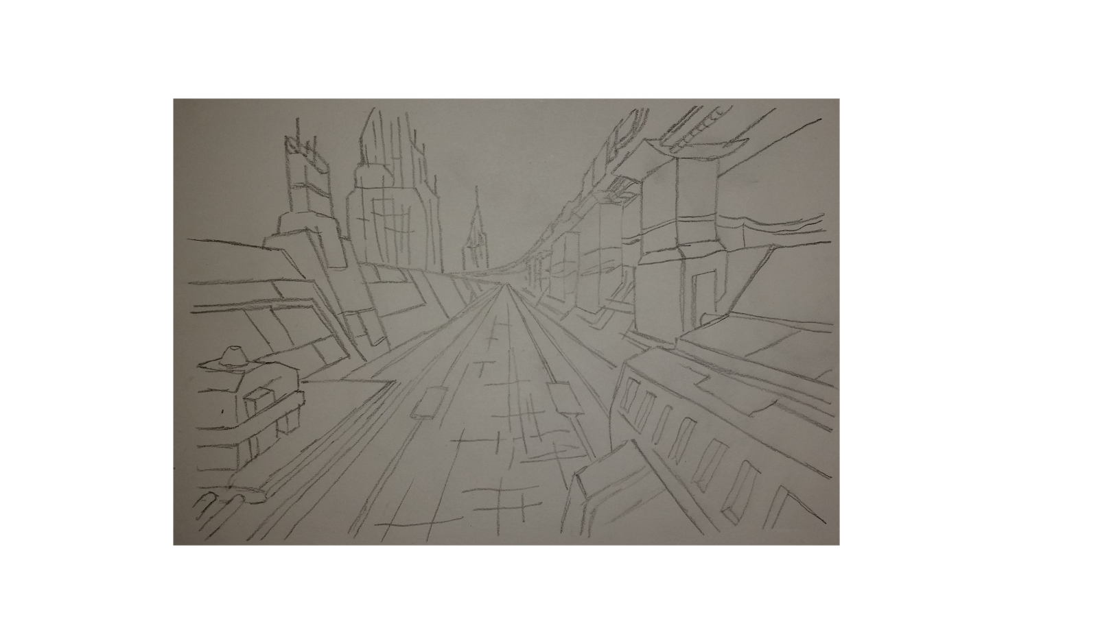
A clear outline of the scene for a better picture soon to be photoshopped.

I used the blending option multiply, made a layer filled with pure white and then a new layer to begin painting. I found doing this in photoshop a great experience since the skies is the limits. It doesn't look 100% realistic to my standards, but I was never really good at making scenes. I added a image that I had found into the background to make the sky, I really liked how it turned out and works effectively within my work.
Scene Final

Report
During the process of creating my final piece it all comes back to the research, having researched many art styles, art pieces and others among the category of art such the museum and building drawing. It all lead up to my final pieces and development.
What I learnt during the process was more skills within the photoshop world, I know that it can never be as good as the real world materials now but I found it a very useful tool within my creation of my work. What else I have learned is the perspective drawing, I wasn't very fond of the scenery creation using perspective etc. but I learned how to create it effective and then to use my photoshop skills within that to boost my knowledge of both perspective drawing and photoshop.
Having been able to used certain materials before doing this assignment I was able to fulfil their maximum extents with the development of my drawing skills, I was able to used techniques such as crosshatching, line drawing and shade & tone. I was also able to used materials successfully such has pen colouring, pencil, watercolour pencils, acrylic and also computer aided materials.
Using pen to create crosshatching has proven to work very effectively as shown within the character 1, I am not the biggest fan of colouring and I prefer to have a nice bit of cross hatching to show shade.
What went well was that I was able to improve my skills further on the more I went into creating my final piece, I have gained a lot of experience in these weeks that have gone by. I was also able to work effectively independently from home which gave me the concentration in my work to come.
What I would do again would be going back to the teacher to seek advice, I thought working independently was very important for me to be able to finish that I had forgotten to get advice as to what would work very well to my extent. I would also change the fact that I wasn't able to create effective scenes for my very detailed prop and characters, I would have liked to focus more on the scene rather than take an image from google or so.
Throughout the process of my creation of all 3 of my ideas I was inspired by the reviews of the story gaining quick access to the major points of the story. Doing this I was able to get enough information on what I would do within my work. After reading it and researching, I thought of a few ideas instantly because of my imagination I definitely went into the futuristic feel to it. I felt like that making it a futuristic piece entirely I believe that the work I produce definitely fits with what the story in fact contains. I have even included a few character representations of what I felt would be suitable which included scenes and clothing of what I felt a character would wear if they happened to work in a brothel. I included a major aspect of the story of which contains the cybernetic eye, although I didn't include it into my final idea's I felt that it was a reliable source to include in my findings and possibilities of using within my final piece.